Wednesday, 18 November 2009
Interview
Here we have conducted an interview asking people five questions about our music video. From this feedback we will hopefully be able to see what necessary changes are needed to improve our video i.e. lighting / camera angles and mise en scene.
Tuesday, 17 November 2009
Permission email from Butch and Femme (Stage Fright)
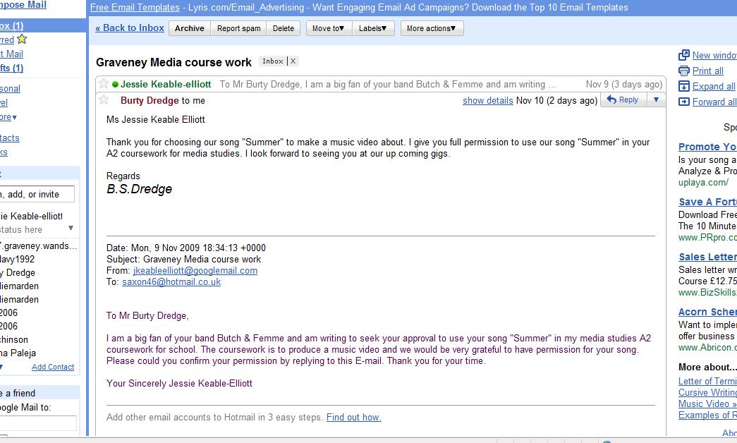
We emailed the artists of the band we were using in our production asking for permission. Here is what they said. This gave us the necessary permision we needed to use their music.
Our footage in i-movie

Magazine advert analysis
In our advert we aimed to create a sense of new identity by producing an eye catching, unique image. We used our motif of green which features in all the other products to create the idea of nature combining with urban. Here is an example of our draft attempt

In this we follow the stereotypical convention of having the artists in the foreground to represent superiority. We also have them facing away from the camera to present attitude which is also a common convention. The font is eye catching and stylish which we would hope will help to sell the product to our target audience 16 - 21. The darkness and trees represents the style of music and therefore may give the audience an idea of what genre this is.

This is the final magazine advert. We decided from the draft that we weren't representing the urban side enough. We decided to have a photo of me opening the doors to almost represent urban society opening the doors to nature and new life. This is an undertone we tried to represent in our production. In the video he is in an urban environment reminiscing about summer. Our title also represents this contrast. This photo represents something unique, (the picture of the band in the forest) being brought into an everyday society. This may be something the audience can relate to and would be good selling point.
Another convention we didn't choose to follow in my product was showing the actor in the foreground of the photo. We also chose to duplicate this photo. We are using this representation to try and create a new modern identity for our product.
Thursday, 12 November 2009
Summer: A2 music video by Ben, Richard, Melissa and Jessie rough cut
Rough cut analysis
We learned from some of our feedback that some of our shots were not steady enough and that the lighting in some of them may not be effective. From this we are hoping to develop our product in final cut pro which will enable us to edit colour settings to a higher standard. We are also planning on re-filming a few shots to make the storyline and narrative we have set out to produce more clear.
Animatic analysis
Our animatic was a very crucial stage in our research and planning activity. It enabled us to form a solid base for a plot and to create a filming schedule. From our animatic we soon learned that some of the shots may have been to long and did not fit with the tempo of the music. Making the cutting rate correlate with the tempo of the music is a necessity in modern day music video production so therefore needed to be taken into consideration. This task was also very useful in helping us start to think about the areas in which to film our production. To gain the urban industrial feel we wanted to produce we decided to film in a very busy place. Therefore from our animatic we changed a few locations to Tooting. This helped us to create a stronger contrast between urban and nature.
Wednesday, 11 November 2009
The Stereophonics album poster analysis

The name of this album is 'keep calm and carry on'. This is a famous term used in a british war poster. This shows how the poster uses intertextuality to direct the message at the audience. They use the idea of struggle and nationalism to give the public the impression that they are some kind of revolutionists. This helps sell the product by creating a close relationship between the audience and the band. The idea of being calm through the storm is also represented in the photo. They use a modern day convention of eating breakfast at a cafe whilst in a storm / the sea. This creates a contrast and presents us with a very eye catching image. The image is very central and the font is very profound and bold, this not only allows us to see the main focus but it also enables the audience to see when it is being released. These factors help sell the product.
Nirvana album advert analysis

This album poster is not only trying to sell the band but is also selling a product. The font is very big and bold, not only does this help the audience to realise the importance of the band, it is also very eye catching. The colour yellow is used throughout, possibly to represent the bands identity and status. The pack shot of the product itself being shown in the foreground is used to represent the direct message of the album poster, (selling the product). The picture that has been taken also emphasizes the nature of the band. jumping with a guitar is seen to be a common convention of a rock genre. This represents stage presence and confidence.
Foo Fighters album cover analysis

Location Research
Before filming we thought it was essential to get the right location to fit in with the storyline of our music video. Here are a few pictures that we took whilst looking for the perfect location.

We decided that this would be a good place to shoot a medium long shot of me standing on the balcony overlooking the shop. We chose this place because it represents out motif of green and combines it with our plot of contrast and urbanization. We are planning for this shot to follow one at the park to create a contrast between nature and the city. This fits in with the storyline nicely as the character is experiencing a time of change after separating from a loved one.

This is another shot we were planning to use. We were planning on having a shot of me on the swings with Jessie (my partner) then her disappearing. It is a common convention for playgrounds and places like this to be a remembrance for people who are a bit older. This also combines nicely with the motif of green which in this shot symbolizes life and hope.
 We considered shooting here in one of the more emotional parts of the song. Wen accessing the scenery we saw that by the garages there was little light being let through and that there was lots of plants and overgrown foliage. This was a useful place because it could help to create a very sad mood and illustrate to the audience a feeling of sadness. It also slightly shows our motif (the colour green).
 Tuesday, 10 November 2009
Media Studies group

This is an image of our Media group working on a design for our magazine advert cover.

When researching whether or not to make a 4 panel digipack or a 6 panel we soon found that most mainstream big selling indie/rock bands (our genre) had produced a 4 panel album pack. Here are a few examples : 
 Here is my analysis on a digipak that is a simular genre to the one we are producing (indie / rock) Please zoom if it is unclear.


Summer by Butch and Femme lyrics
Summers back, she's here again
The girl I've loved since i was 10
we used to sit by the river
Mississippi too
We signed songs and hold hands
That's why i wrote this song for you
Down south in Louisiana
Going south in Summer
We can plough the fields till dawn
We could get it on
We've always lived next to each other
never knew nothing other
my daddy was a porter farmer
her daddy too
We used to sit out on the long plains
talking bout all things knew
Down south in Louisiana
down south in Summer
We can plough the fields till dawn
We could get it on
Down south in Louisiana
going south in Summer
We can plough the fields till dawn
We could get it on
We could get it on
We could get it on
We could get it on
First draft of the Script
- Panning shot of trees and sky (about 5 seconds)
- Extreme close-up of eyes (about 3 seconds)
- Magpies flying away
- Establishing shot of field and Ben lying down
- Hands in / out of focus on the grass
- Tracking shot of flowers
- fade black into pan of feet to mouth then Ben mouthing
- Medium shot of me sitting up
- Medium shot of Me sitting up in transition
- Long shot of me walking towards busy road
- close-up of legs and feet
- the band shot
- under bench feet walking
- the band shot
- walking past train
Missy Elliot album cover analysis
 The name of this album is 'this is not a test'. This correlates with the stereotypical connotations of hip hop which suggest competition and superiority. Another factor of the front cover that conveys superiority is the fact there are three women standing in the background, it is almost like Missy Elliot is their leader. The bull terrier dogs and the expression on her face signify attitude this is not only the stereotypical connotation of a hip hop genre but also of rock. When viewing this we thought it was important to think about in our album cover. The colour red in the background combined with the black outfit she is wearing to give an almost angry mood. The big speakers on the army truck suggest that people are going to hear her music whether they like it or not. This again suggests superiority. The positioning of the artist is looking at the camera standing at the front of the picture. This again shows her attitude and high status.
Costume analysis
In our video we are aiming to achieve a contrast between urban and 'Summer', the title. In this idea we have used the idea of modern day youth. The stance that I am showing is to represent attitude which a common convention of an urban theme and an indie rock genre.
Music video research
When researching out music video genre we looked at several other indie/rock genre bands. Here are some comments we found that we thought would be useful when putting forward ideas about our video. (taken from the video Radiohead - no suprises and The Kooks - naive)


After looking at these youtube videos it became apparent that there were certain themes that people liked and wanted to see in a indie rock video. Using these themes we decided to design a questionnaire to gain some more information on what out target audience would expect and enjoy (ages 16 - 25).

the Killers magazine advert analysis

This magazine advert is a good idea of a advert for a conventional rock band the disco balls spelling the Killers in big bold font does not only show us this band is glamorous but it is also very eye catching. Considering our genre is indie-rock we though it would be important to consider this advert. The colour purplerepresented in the sky has connotationsof royalty, this correlates with the pictureof the ‘Royal Albert Hall’ and makes it very clear to the audience what message the Killers are trying to put across (high status and royalty). They also manage to create a good contrast using cacti and palm trees possibly to represent their hometown of the USA. This contrasts with the rather grand building in the background. When thinking about this it helped us to think about creating a contrast in out advert possibly of urban and nature.
Kanye West - Heartless music video analysis
This video is a good example of a modernised music video – cartoon. It uses a very fast cutting rate and which adopts the stereotypical style of a modern music video. This has an abrupt effect on the audience and does not let them focus on one particular shot, therefore when the pace decreases there concentration is on the man and woman.
Special effects are also used to help emphasize the characters situation and facial expressions as they are dressed in black clothing which makes them stand out.
Lots of flashing lights combined with a series of medium long shots which suggests excitement and possibly the theme of destruction. This is eventually unravelled as we learn about the love tragedy story-line.
Lots of flashing lights combined with a series of medium long shots which suggests excitement and possibly the theme of destruction. This is eventually unravelled as we learn about the love tragedy story-line.
High angle shots of the artist (example of the superiority associated with modern day rap stars). This also combines with the lyrics as we learn he is the main point of focus when he says 'how could you be so heartless', this allows us to realise that he is talking about the women in the next shot which spells out romance to the audience.
When he is smoking a cigarette this creates a theme of depression and heartbreak and this fits in with the nature of the song. This shot is a low angle medium close-up shot with flashing lights in the background which is associating modern day life with depression. This could also be associating modern day relationships with depression.
Tracking shot of artist signifying independence and superiority which could motivate the audience into independence
Male and female looking into camera representing the theme of love
Very colourful and eye catching - to appeals to the audience
Point of view shot combined with an over the shoulder shot to make the audience feel emotionally involved.
The video ends with a still medium shot of the woman walking out of a door. There is then a fade and a stop to the music. This is signifying the end of not only the music video but of their relationship. This leaves the audience with something to think about.
The Kooks - naive
This band is an example of indie music and I thought it would be important to study this because this is the genre we have chosen for our film.
Starts off with low key lighting to set the tone and the theme of sadness for the rest of the video.
Starts off with low key lighting to set the tone and the theme of sadness for the rest of the video.
The first shot is a tracking shot of a young male walking out of a industrial building. This does not even allow the audience to focus their attention on this person but it could also be representing the social group of youth. This setting could be conventional of someone at university or living on low costs. This could be representing social class combined with youth to create the idea of depression. We are introduced to a woman which instantly makes the audience think about the theme of love.
The song title naive fits in with the storyline
A man is on the floor and woman standing up which could be representing power
Quite a slow cutting rate (may need to be considered in our video)
Series of close up shots of the singers face to show emotion.
A man is on the floor and woman standing up which could be representing power
Quite a slow cutting rate (may need to be considered in our video)
Series of close up shots of the singers face to show emotion.
Subscribe to:
Posts (Atom)